- Maxime
- 14 Jan, 2019
Technical blog
A more subdued subheader
A more subdued subheader
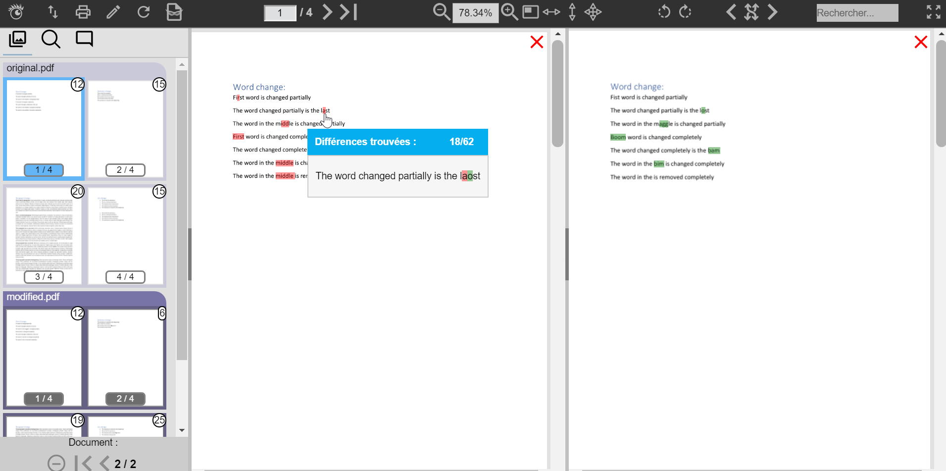
ARender 3 document comparison was made to show a maximum of differences with a complex color code. Though precise, it could lead to confusing scenarios when the documents were heavily modified.
To leverage that, we reworked and simplified both the comparison algorithm used and the visual representation of the differences.
Hover popups allows the end user to quickly know which text has been replaced/modified and by what.

As well, the document on the left will now always contain modifications shown in red (previous) while the right one will always show in green (new document version). This aims at clarifying that those differences are shown as transitions from the left document to the right.